As a young beginner in the world of architecture, Antoni Gaudi captured my attention with his original and expressionist works as I said over and over again. I talked before about Casa Battlo one of his iconic works and a masterpiece of the architectural hertitage of Barcelona and the world also!
In this article, I will talk about another masterpiece of Antoni Gaudi which is the one and only : CASA VICENS
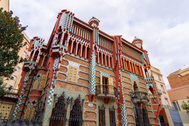
Casa Vicens, Barcelona, Spain 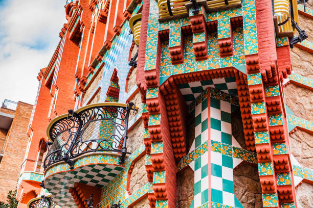
Vicens House in Barcelona, Spain 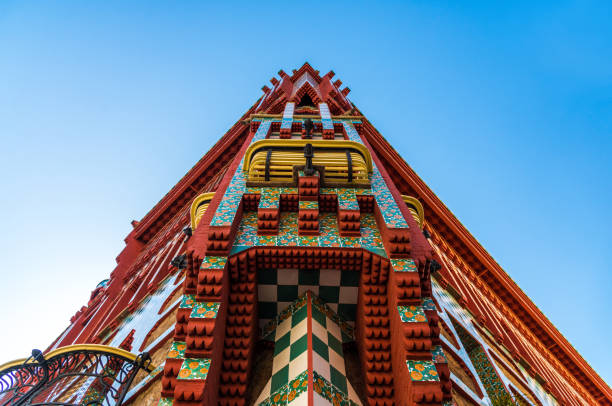
i 
Casa Vicens, a museum in Barcelona, Spain
PRESENTATION OF CASA VICENS:
Casa Vicens was built between 1883 and 1885 by the famous architect Antoni GaudI who in the past, began his architecture career. He was hired by Manel Vicens and Montanar a stock and currency broker to design his summer garden house in the former village of Gracia. Casa Vicens, then, will become the first official masterpiece of Gaudi and the work that will explode his carrer making him more famous. It is also, like the majority of his works, a symbol of the Catalan modernist movement.
Casa Vicens contains a garden,a basement, main floor, first floor, second floor and a rooftop.
As the house had been turned into a museum,there was a renovation project in 1925 to make the house more able to receive visitors. But I will talk and approach the original version designed by Antoni Gaudi in 1883 and 1885.
PLANS OF CASA VICENS:
Basement:
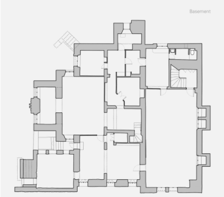
This part of the house originally housed the coal cellar under Catalan vaults.
With the renovation, it is now the library where the tourists can buy books about the first house of Gaudi or ask questions for more informations.
Main Floor:
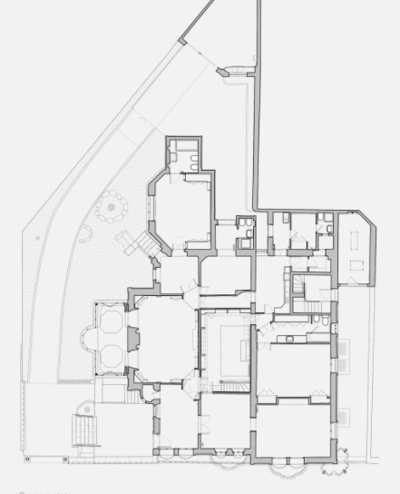
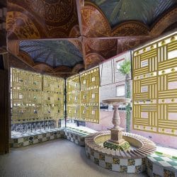
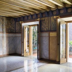
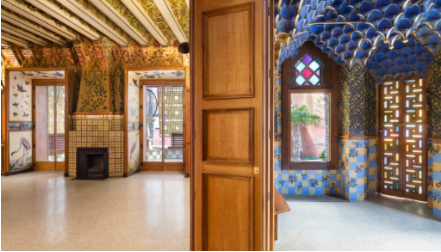
On the main floor of Casa Vicens, we have the whole living area and the spaces for day living namely the dining room, a smoking room,… The smoking room is a place to have fun and relax, it’s a real oasis show; the multiple representations of palm trees and cluster dates using multi plaster mocarabs on the ceiling adding to this the blue, green and gold colours. Under the papier-mâché tiles, the wainscoting in this room alternates ocher and sky blue tiles, with red and yellow roses painted in oil above. The dining room contains a wooden decoration designed by Gaudi himself , a collection of 32 paintings by Torrescassana.
First Floor:
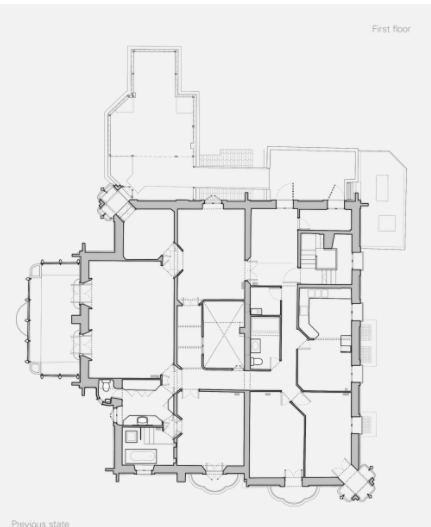
In the first floor, we find the private aspect of the Vicens’s family, as long as it contains 2 bedrooms a bath and a sitting room. This floor also have a terrace which located at the top of the covered porch. Above the smoking roomthere is a small sitting room with a false dome, in gold, with its spectacular trompe-l’oeil.
Second Floor:
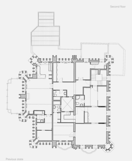
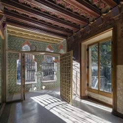
It is an open space with exposed wood beams supporting the various sections of the pitched roof and windows on three sides, creating a Moorish calligraphy of protruding and withdrawing elements that bring an interesting play of light and shadow.
Rooftop:
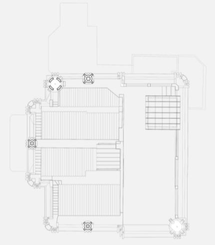
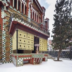
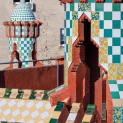
Gaudi for his first house, he realised at the same time his first accessible roof, it is represented in form of a walkaway around all four sides of the pitched roof, with curved terracotta roof tiles to collect the water. The roof top is also composed of a small cupola crowns the tower on the western corner of the façade and three identical brick structures. These structures and the façade also are clad in green and white ceramic tiles and show how Gaudí was influenced by Islamic and Asian architecture.
The Façade:
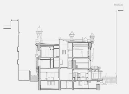
On this ection of the Façade, we can see the repartition of the basement plus the other floors and the chimney towers on the terrace.
PICTURES OF THE INTERIOR OF CASA VICENS:
ANALYSIS:
RYTHM: We can’t talk about a clear rythm in this house, eventough there is some manifestations of a rythmic architecture.
AXIS AND GRIDS: talking about axis and grids in Antoni Gaudi’s work is a big contradiction, as long as Gaudi’s architecture is all about waves and the absence of straight and sharp lines.
SYMMETRY: with the abscence of axis and grids, there is automatically an abscence of symmetry in this house. There is no symmetrical disposition in the whole design of the house.
HIERARCHY: The potential hierarchy is in the design of the façade. In the two first floors the design is more “simple” than the last floors which contains a red painting, and with and green mosaic. In addition of the two towers on the roof.
REPETITION: In casa Vicens, we can notice some repetion, especially in the decoration and the paintings. But most of the time every room and corner is unique and different.
CONTRAST: The contrast is noticeable at the first place in the façade compared to the other houses in the neighboorhood. Then, in the colour used, the contrast is the key of Gaudi architecture and decoration; The use of bright and colours with attitude (red, green, yellow, green..) and also the choice of the materials contributes at the contrast.
BALANCE: Eventough we can find irregularities in the scals, asymetery, different colours; the whole mixed togheter and with the Gaudi’s expressionist architecture; there is a balance that is created.
COLORS AND TEXTURES: The colors and the textures are the elements that caraterize Gaudi’s works; the mix between the colors and the textures as the papier-mâché, ceramic, wood… Is awork of art that capture every visitor.
PROPORTIONS: The house doesn’t have real proportions that regulate it’s measurements.
LIGHT: The house receive a good quantity of light and have a great exposition du to the big windows in each floor and the terrace of the second floor.
UNIT: Eventough we have a lot of irregularities and no clear proportions, we have a unit or and aesthethic that is more or less followed to keep a meaning to the construction.
LIMIT: The house is limited by walls since it was a house for perons to live in, so it was important to preserve their private life.
THE FUNCTION OF THE HOUSE: As I mentioned before this house was designed by Gaudi for Manel Vicens as a reproduction of his summer garden house.
MATERIALS USED: To serve his insipration from flor and fauna and nature in general, Gaudi used principally: papier-mâché tiles, ceramic, wood, marble (for th fountain), bricks,
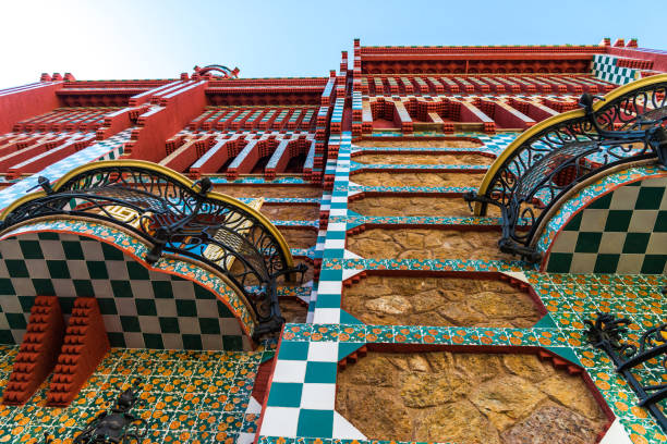
Casa Vicens by Antoni Gaudi 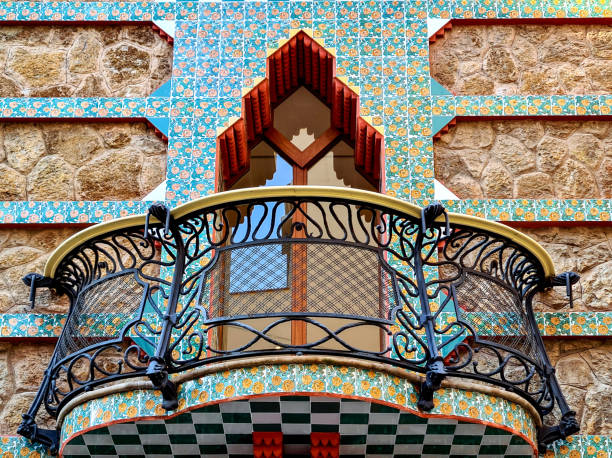
Barcelona, Spain , Balcony on Casa Vicens Gaudí 
Casa Vicens, Spain
BIBLIOGRAPHY:
https://casavicens.org/casa-vicens/the-house/
https://www.istockphoto.com/es/search/2/image?phrase=casa+vicens
https://casavicens.org/es/multimedia/la-casa/
https://www.archisoup.com/architecture-composition
https://www.ceramicarchitectures.com/obras/vicens-house-rehabilitation/
